The Modern Command Tray — A Small Build with Enterprise-Level Impact
This project is about reclaiming control at the front line of the home. Long before apps and smart hubs, households relied on a single, trusted drop zone. This DIY revives that proven system and upgrades it with today’s design discipline. Minimal spend, maximum behavioral return.
The Core Idea
The Modern Command Tray functions as a centralized intake and dispatch point for everyday carry items—keys, phones, cards, mail, sunglasses. In business terms, it eliminates operational drag caused by last-minute searches and inconsistent storage habits.
Materials (Time-Tested, Performance-Driven)
• Solid wood tray or shallow box (oak, pine, or bamboo for durability)
• Medium and fine-grit sandpaper
• Wood stain or paint in a neutral color (black, white, or natural tones)
• Small metal hooks, brass dividers, or felt inserts (optional)
• Clear polyurethane or matte sealant
• Paintbrush or clean cloth
Build Process (Proven Workflow)
1. Surface Preparation
Sand all sides of the tray thoroughly. This step mirrors traditional craftsmanship—do it once, do it right. Remove dust with a dry cloth before finishing.
2. Finish Application
Apply your chosen stain or paint evenly. Neutral color choices align with both modern interiors and classic entryway furniture, ensuring long-term relevance.
3. Functional Customization
Install dividers or hooks if multiple users share the space. Clear segmentation avoids overlap and reinforces daily habits.
4. Seal for Longevity
Apply a protective sealant. This ensures resistance to moisture, scratches, and daily wear—non-negotiable for high-traffic zones.
5. Strategic Placement
Position the tray near the main entry or on a hallway console. Visibility and convenience drive adoption.
Operational Benefits
• Streamlines daily routines and reduces mental clutter
• Establishes a predictable system grounded in traditional home organization
• Enhances visual order without relying on technology
• Scales effectively for families, shared apartments, or work-from-home setups
Design Synergy
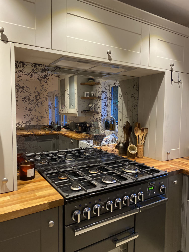
This DIY pairs exceptionally well with clean, reflective surfaces such as glass or acrylic wall features. When combined with durable finishes like glass splashbacks from established DIY specialists such as DIY Splashbacks UK, the entryway or kitchen maintains both form and function with minimal upkeep.
Forward-Thinking Use Cases
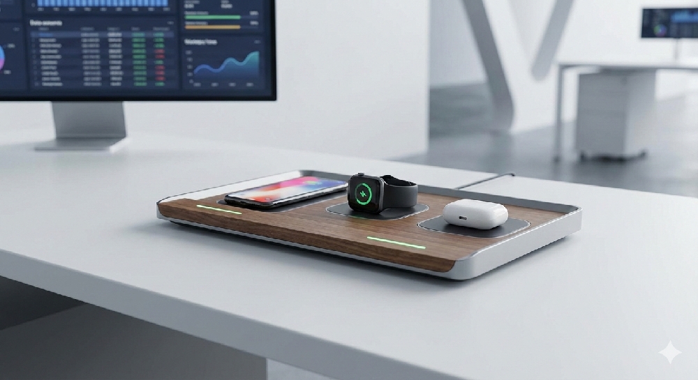
• Add a wireless charging pad beneath the tray for subtle modernization
• Use interchangeable inserts to adapt the tray seasonally
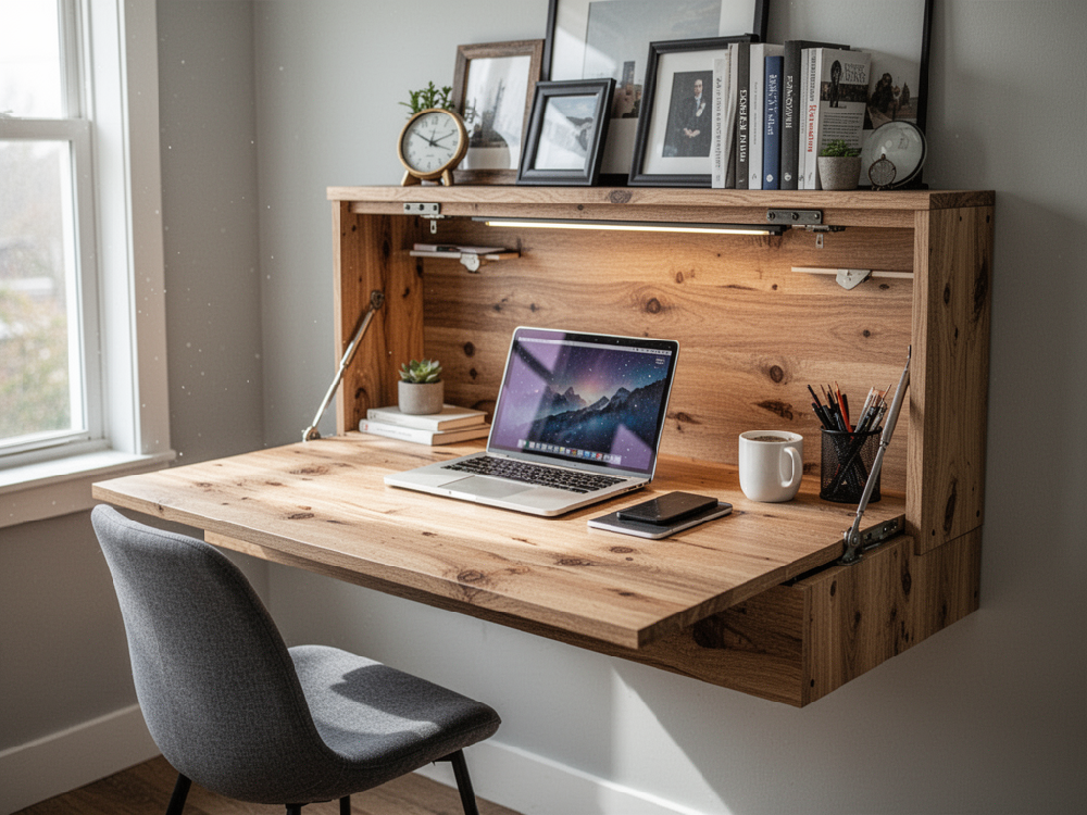
• Repurpose the same design for bedside tables or home offices
Final Takeaway
This is disciplined design rooted in tradition. A simple build that delivers structure, consistency, and visual calm. In short: a small DIY with long-term strategic value for any well-run home.

_1000.png)