What Colors or Finishes Are Most Popular for Splashbacks in 2026?
Choosing the right splashback is no longer a simple decorative decision. It is a strategic design investment that shapes light, mood, resale perception, and long-term relevance within the kitchen environment. Current direction shows a careful balance between timeless neutrality and expressive modern color—where tradition meets controlled innovation.
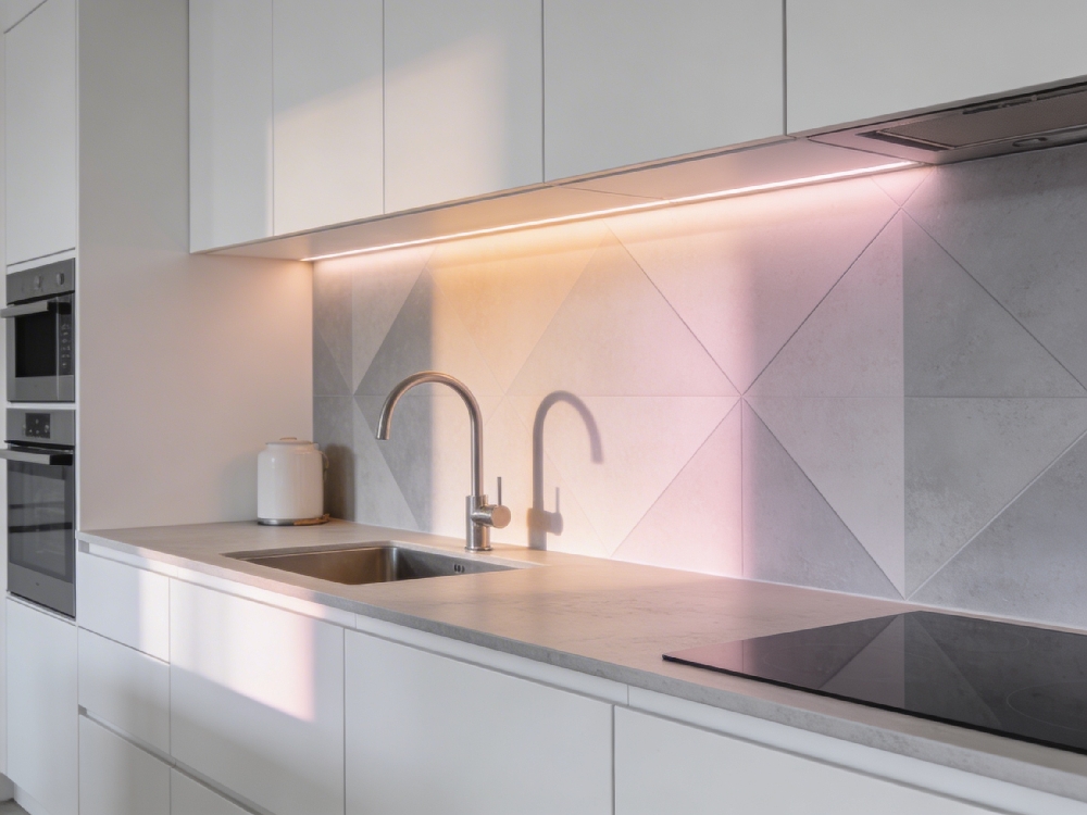
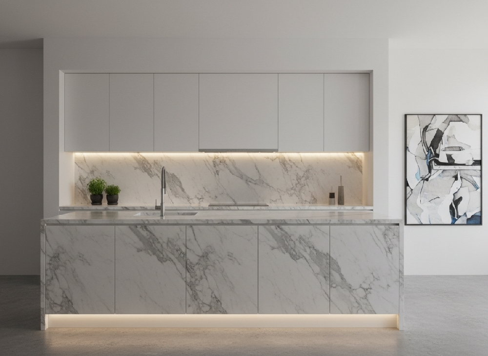
Neutral Foundations Still Lead the Market
Soft whites, greys, and muted earth tones continue to anchor splashback design because they integrate easily with cabinetry, countertops, and future renovations. These shades provide flexibility while preserving visual longevity, which is why they remain widely specified across modern and traditional kitchens alike.
At the same time, interior color forecasts show warmer nostalgic hues such as butter yellow, dusty pink, powder blue, and avocado green gaining renewed popularity for their versatility and comforting feel.
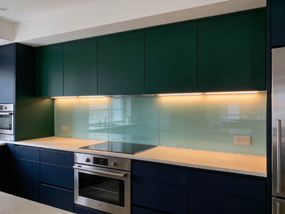
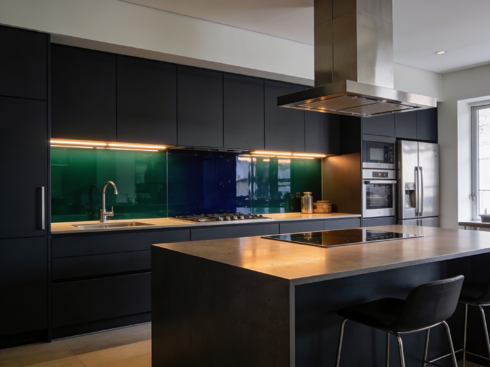
Deep Greens, Blues, and Jewel Tones Signal Confidence
Design momentum is shifting toward richer organic colors—forest green, navy blue, emerald, and burgundy—used either as full splashbacks or controlled accent zones. These tones create depth, sophistication, and a clear focal point within open-plan kitchens.
Broader interior trends reinforce this move toward expressive palettes, with designers highlighting earthy ochres, olive greens, muddy blues, and deep plums as defining colors for 2026 interiors.
Matte, Textured, and Metallic Finishes Are Expanding Choice
Gloss once dominated splashback surfaces, but matte and textured finishes are now gaining ground for their understated elegance and reduced visibility of marks or fingerprints.
Simultaneously, metallic and mirrored splashbacks—such as copper, bronze, gold, or reflective glass—are rising in popularity because they enhance light distribution and create a premium visual effect, particularly in compact spaces.
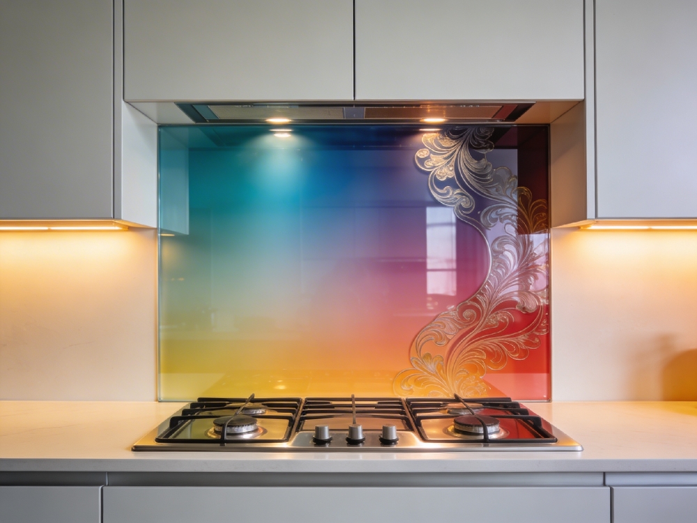
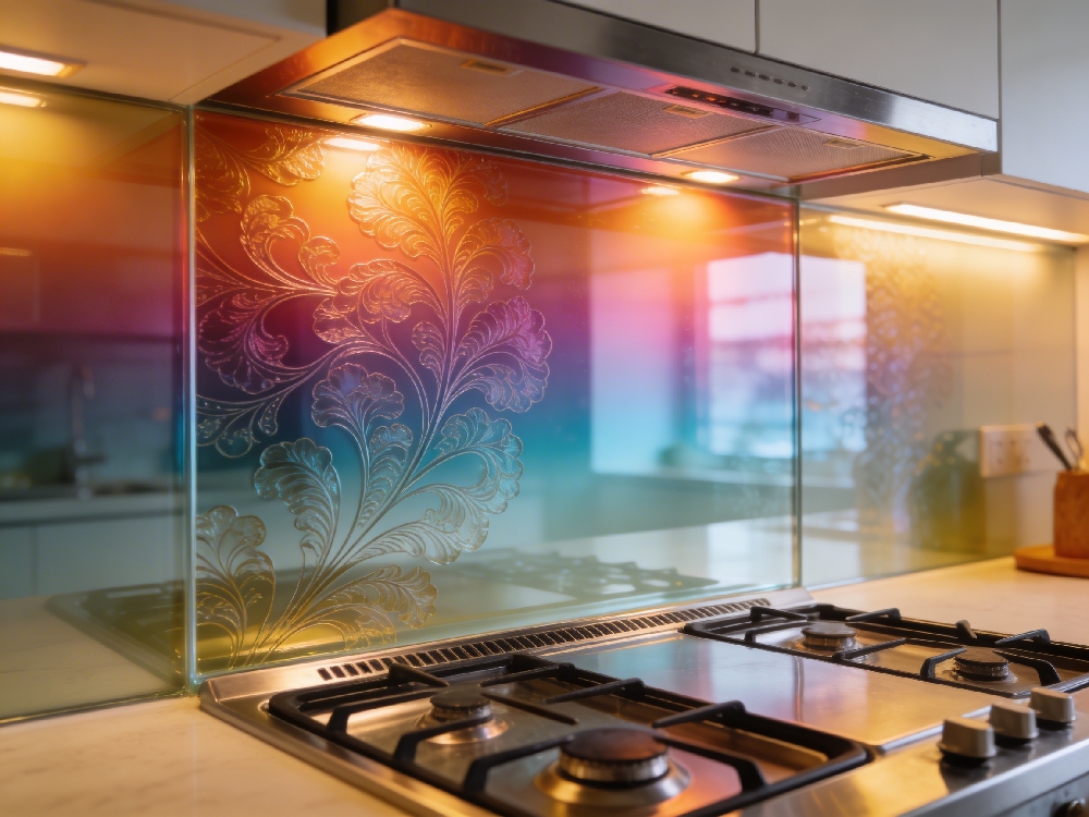
Soft Pastels and Artistic Designs Offer Subtle Personality
Not every trend is bold. Soft pastel tones—blush, sage, powder blue—are returning as calm, elegant alternatives that maintain brightness without overwhelming the space.
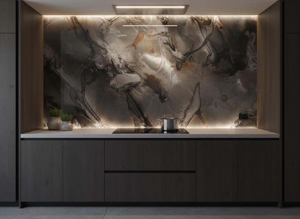
Meanwhile, personalization is accelerating through printed glass, gradients, terrazzo patterns, and bespoke artwork splashbacks, allowing homeowners to transform functional wall protection into a visual centerpiece.
Strategic Takeaway
The modern splashback landscape is defined by balanced contrast:
Neutral tones ensure longevity and resale flexibility.
Deep organic colors introduce confidence and visual depth.
Matte, metallic, and textured finishes elevate sophistication.
Pastels and custom artwork provide controlled individuality.
This convergence of heritage calm and modern expression reflects the broader direction of interior design—spaces that feel warm, personal, and enduring rather than purely trend-driven.
For homeowners seeking tailored color matching, reflective glass, or bespoke printed designs, solutions such as those available through DIY Splashbacks design collections demonstrate how customization and durability can align within a single installation strategy.